Again, brightness and contrast are in the focus, but this time let’s go deeper in the topic.
Tone curve…

… is to be found in the usual right-side section, under Presence, which we have introduced in the previous article. This is the second biggest editing group after Basic group and its functions are quite similar to tone correction options we have discussed before, although it can be used for more things.
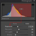
It consists of three major parts. On top a histogram and an adjustable tone curve, in the middle four sliders for the various hue regions, at the bottom a menu for adjusting the type of the tone curve.
Regions
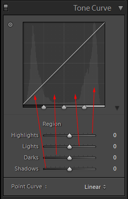
The sliders and the upper histogram serve the same purpose. They are used for setting the specific hue regions. They illustrate the hue distribution of the whole picture at the horizontal axe of the histogram. The left shows the amount of the darkest pixels, while the right shows the brightest pixels. Histogram can be divided into four major regions in this direction:
Left 0-20%: Shadows, i.e. the darkest, shady areas.
Left 20-50%: Darks, i.e. dark areas.
Right 50-80%: Lights, i.e. bright areas:
Right 80-100%: Highlights refer to the brightest pixels of the photo.
These areas can be adjusted separately with sliders. Shift to the left for a change to dark, and shift to the right for brightening.
There’s a diagonal line in histogram, which helps set tone of the picture per sections. Point 4 describes this option.
At the bottom, in Tone Curve menu, you can set three types of tone curves.
With Linear setting, the curve will be the widest, which means a wide hue range and a low contrast. This is recommended for pictures with a big difference in contrasts (building, landscape).
The other two settings (Medium Contrast, Strong Contrast) speak for themselves. They provide a smaller and smaller hue range but an increasing contrast.
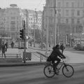
Regions in the picture
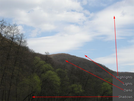
The different tone curve regions can usually be discerned in a pictures. The brightest parts of the clouds are the highlights in our sample photo so Highlights slider will regulate their brightness. Lights section refers to the blue sky in our case, and also the greyish edges of the clouds. Darks regulate the dark shades of the hills and the foliage of the trees, while Shadows affect the shady, even black tree trunks.
However, bear in mind that changing a section may slightly influence the neighboring regions as well. If you increase brightness of Lights areas for example, then pixels in Highlights and Darks regions will.
We will curve the curve even more
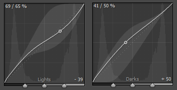
By regulating histogram curve, you can achieve adjustments similar to those with sliders but even more fine-tuned. You can click on any point of the line and the curve can be shifted up and down by keeping the mouse button pressed. This way you can increase or decrease not only the tone of the regions but also any tone points within. Increase involves brightening, while decrease means darkening of the photo. Click on any point and a lighter bubble appears around it, which indicate the borderline of modifications. The curve cannot be shifted beyond. Coordinates of the point can be seen in the top left corner, while the extent of modifications appears in the bottom right corner. Down in the middle you can also see the sections that the modification will affect. Accordingly, the slider of the given section will be shifted.
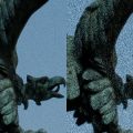
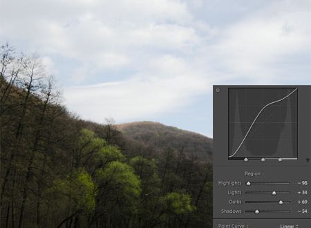
After work
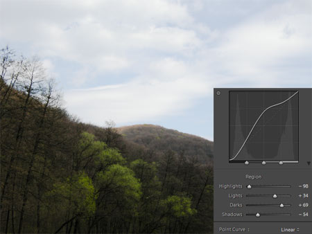
After a couple of shifting you can see the resulting picture here above. We have increased the contrasts in the woody-hilly part at the bottom. Foreground and its details can be more easily discerned, they stand out more from the back-hill in the center, which now has more depth to it. Well, the sky has fallen victim to our actions, but a few changes will make it look much better. We have used Linear settings in the bottom menu of course.
If you click Y button, the original photo appears on the left side of the screen while the right side shows the modified version. This way changes can be monitored constantly.