Photoshop Touch may well be the most compact image editing software available for Android.
We are launching a new series that introduces Photoshop Touch on Android. Photoshop Touch may well be the most compact image editing software available for this operating system, so if you take a picture with your cellphone or tablet and wish to edit it in more professional level than “clicking on the icon of the specific effect”, you are at the right place.
This application is even capable of handling layers, but let’s begin with the basic image modification settings, which help you set the hue, saturation and the brightness/contrast proportion of the picture. All you need is a photo taken by a cellphone (the software actually handles any photo stored on the mobile tool).
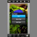
Opening the photo is quite simple as the opening interface will automatically appear when starting Photoshop Touch, where you can choose to select a photo from the Photo Library on your cellphone or from Adobe Creative Cloud file sharing site, but you can also take a new picture with the phone’s camera (Camera). You can also open a Blank Document or a document that has been pasted on Clipboard.
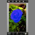
Now let’s deal with this somewhat bluish-purple flower that looks like this on the software’s work interface.
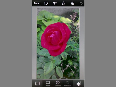
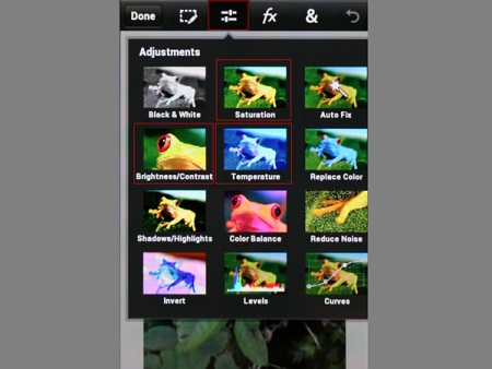
The work interface of Photoshop Touch vaguely resembles the PC version, and so you’ll find photo enhancement tools in the upper menu. The third icon from the left opens Adjustments palette, where small pictures illustrate what each command will do to the photo.
We’ll need three of these: Temperature influencing color temperature, Brightness/ Contrast and Saturation.
Start with color temperature, which helps when a photo is too yellowish or bluish, you can turn the colors colder or warmer with it.
Click on Temperature icon and a simple user interface with a single setting slider pops up at the bottom of the picture. Touch and drag it towards -100, and the photo receives colder colors, while the direction towards +100 gives it warmer, yellowish hues. Since our sample photo is quite bluish-purple, we’ll need the latter direction. In our case +28-30 was enough to make the colors look more sun-kissed. The result shows on the photo immediately.
When ready, touch the tick icon in the bottom right corner, and if you want to discard the changes, then touch the X sign.

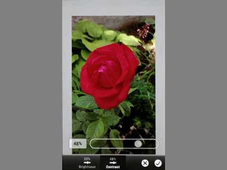
With this you return to the main work interface, where again open Adjustmnents (third icon at the top) and now choose Brightness/Contrast option.
You’ll find similar setting options, but now there are two kinds of buttons. Brightness and contrast can be adjusted separately.
Select Brightness to brighten the photo a bit with the slider. +22 will be just fine. It’s a good idea to slightly over-increase brightness because contrast increase will strengthen blacks, which will then compensate this. You can always switch between the two values and adjust them afterwards until you are satisfied.
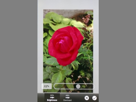
Next, touch Contrast button and increase the value on the slider here as well. Since our sample picture lacks in contrast, a value of 48% will do. Once the picture is ready, click on the bottom left tick.
There’s only Saturation left, so go into Adjustment menu again and select Saturation command.
Its user interface looks quite like the previous ones but with one slider only. Touch and drag it higher to turn the grey and dull colors into something richer. Of course, this is no cure for a completely colorless photo.
Now we opted for 24% and then finalized the adjustment touching the tickle icon. The photo is now practically finished, parading a vibrant flower instead of the originally flat and cold colored version.
When leaving the software app, it will automatically ask you about saving, which is saving it to Photoshop Touch gallery. We’ll show how to save in an outer gallery and sharing as well in a later article, and next time we are going to deal with another form of photo adjustment.