We used Photoshop’s Hue/Saturation feature, for example to make a color range (a color defect) disappear. Now it is the other way around: we emphasize a color range by shifting it to a slightly different hue. Hue/Saturation can be a perfect tool for manipulating a specific color group. Now let’s get down to manipulating!
Load the photo
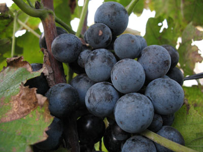
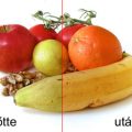
I don’t really like what I see here. These grapes, naturally a purplish blue, look rather greenish here. Our goal is to make them purplish blue indeed, and also raise saturation a little in the meantime. Of course, the green leaves should stay green!
Adjustment layer
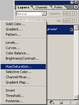
Open a new adjustment layer on the toolbar at the bottom of the Layers palette (Create New Fill and Adjustment Layer), and select Hue/Saturation from the dropdown. You can also select this feature from the Image menu, but using an adjustment layer lets you set the hue afterwards, and the saturation change will also use a layer of its own that can be matched with the base layer using color blending. We’ll talk about this later. And don’t worry, it will be much clearer in practice.
The proper color
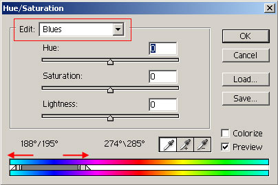
In this example, the main point is to adjust the color of the grapes, so from the Edit dropdown, select Blues. The selected color range can be seen at the bottom of the dialog. For now, we dragged the borders a bit wider apart: the right slider towards purples, and the left one towards cyans. Since the picture contains no blue things apart from the grapes, only the fruits will change their bluish hues.
Finally!
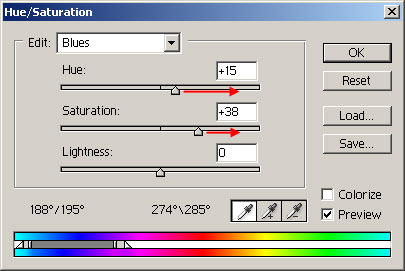
Finally, we got to color adjustment. Drag the Hue slider a bit to the right, towards purple hues. In this example, this means a difference of +15. That will reduce the greenish tint of the grapes. Now drag the Saturation slider to the right, and surprise! Saturation rises.
Pay attention not to overdo this as it can result in increased color noise.
A secret unveiled
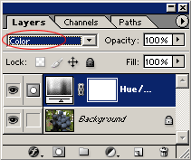
Why did we need to put the Hue/Saturation adjustment onto an adjustment layer? Set the layer’s blending mode to Color so that the bottom layer—the original image—will only be affected by the color change. Much less color noise is added this way.
Ripe for the taking
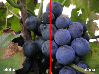
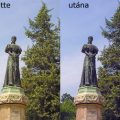
before / after
The left half shows the original picture, while the right one is the result. No further explanation seems to be necessary. This is just what we wanted.