Adobe Photoshop Elements 5.0, released last autumn, offers a couple of useful new editing tools in its already broad range. In the following articles, we’ll introduce the newest tools of this version in practice. First of all, we’ll discuss the professional black-and-white converter that was hitherto available only for “full” Photoshop users.
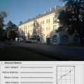
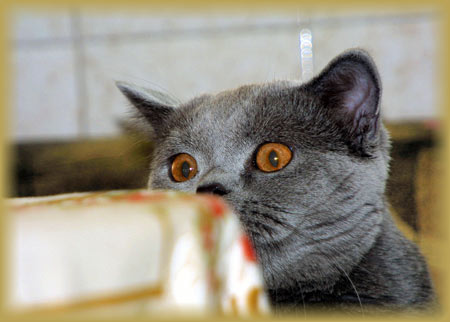
Load the photo in Photoshop Elements

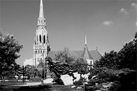
It may seem that you have an easy job if you want to convert this photo to B&W…
Simply done
….as you just have to click Enhance/Adjust Color/Remove Color or press Ctrl+Shift+U to do so. The result can be seen above, but we’re not really satisfied with it. It looks so dull. How about making a much more vivid B&W image with sufficient contrast? It can be done easily by separately filtering the color channels.
What Elements offers

The black-and-white conversion takes three steps instead of one, but it’s still not very complex. You can see the original (Before) and the preview image (After) at the top of the dialog. Underneath, you’ll find a short explanation for the feature.
It clears up the basics quite well. If you’d like more guidelines anyway, the steps are indicated with numbers. In step 1 (Select a style), you can choose the style mentioned in the explanation on the dialog. There are 6 of them, according to the theme of the photo. The styles adjust the proportions of the three color channels accordingly, so that the final B&W image only reflects their lightness. The basic styles will be explained in more detail in the next section.
The intensity of the style can be specified in step 2 (Adjustment Intensity) on a slider.
Ultimate refining is done in step 3. Here, you can click the small preview images that can further lighten or darken the three color channels and the contrast:
More Red: Originally red, orange and brown areas lighten in the B&W image.
Less Red: The same areas will darken.
More Green: Originally green areas (e.g. foliage) lighten in the final image.
Less Green: The same areas will darken.
More Blue: Originally blue areas (e.g. sky, water) lighten in the final image.
Less Blue: The same areas will darken.
More Contrast: Contrast increases.
Less Contrast: Contrast decreases.
Styles

1. Portraits: Blue channel is darkened, so skin tones get darker in B&W.
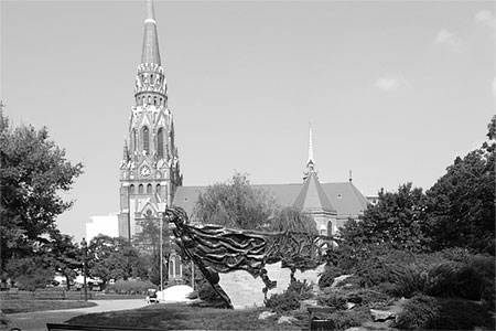
2. Vivid Landscape: Green and blue channels are darkened while red is weakened. This way, sky and foliage will be darker in B&W.
3. Scenic Landscape: Similar to the previous setting, but with less blue/green darkening and darker reds.
4. Urban/Snapshots: Similar to portrait, but with slightly darker greens.
5. Newspaper: Strong contrast.
6. Infrared Effect: Imitates an infrared filter. Foliage is light, sky is dark.
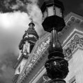
Colorless
We have used the Vivid Landscape style that made the foliage and the sky darker, and weakened the lightness of the red channel. This caused the originally brown temple to stick out of the dark background more emphatically. To increase the effect, we have clicked Less Bluetwice to make the sky even darker, and More Contrast once to provide a stronger contrast.