We have run a few rounds around white balance, but it’s time for us to introduce a new method. We will apply an eyedropper tool and color channels, as well as an unjustly overlooked simple command, Color Balance. There’s no separate White Balance tool in Photoshop, but the four samples we had illustrate that correction of white balance is quite manageable without it too.
Load the photo in Photoshop
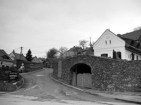
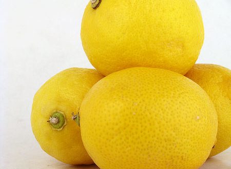
Colors have shifted a bit in this photo. The background should be greyish white, while the lemons should be more yellow. But instead, as if a green veil was there in the photo. The topic was lighted by light bulbs and the automatic white balance setting of the camera was not at its best form.
Five eyedroppers
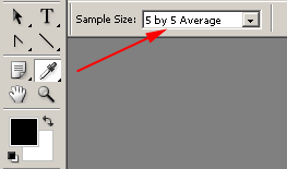
Let’s begin with clicking on Eyedropper tool, and then set Sample Size at 5×5 in the options. Later you will need the eyedropper, and when taking a sample, the bigger the selected area, the better. There are several methods for adjusting contrast. Feel free to browse around the links at the bottom of this page. We chose to use Image/Adjustments/Levels to set hues level.
On the dialog, you’ll have to adjust two arrows on the sides from the three (the black and the white one). Drag them towards the middle of the diagram so that they at least touch the edges of the “mountain” in the histogram above. You can drag the black arrow even further. This will make contrast areas in the foreground overly dark, but it is the town that matters to us now.
Set the arrows as desired, and keep an eye on how the original photo changes in the meantime.
Really greenish
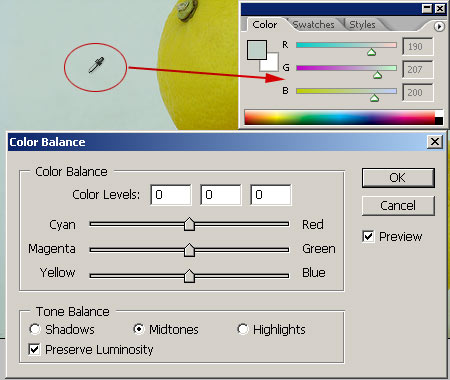
Now comes Image/Adjustments/Color Balance command in the menu. The name of this command will do exactly what its name suggests. This will restore color balance. There is a slider for shifting color intervals respectively: Cyan-Red at the top, then Magenta-Green and finally Yellow-Blue. Tone Balance at the bottom defines whether the modifications should affect Shadows, Midtones or Highlights.
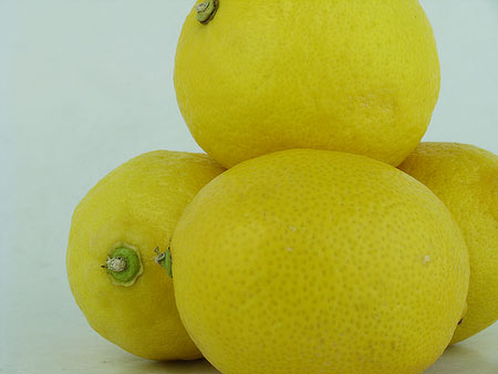
It seems very simple, but it’s not very accurate if you rely on your eyesight only in shifting the sliders. It’s better to use eyedropper. Just click on any point of the photo outside Color Balance dialog. If possible, choose a point which is grey or close to grey. In our case, it is a point in the background. More precisely, it is a 5×5 point, as we set the eyedropper at a bigger size so that it takes the average of an area. The result is more accurate this way. If you click on the photo with the eyedropper and then look to the right at Color palette, you will see the root of the problem. R, which is the red channel, is at the value of 190 in our case, G (green) is 207, so it is stronger, and B(blue) is 200. The point you clicked on should be grey. In case of color grey, all three values are the same. At present, our photo is greenish (207) with a lower blue (200) and red (190) value. To achieve a grey color, all three must be set at the same value.
…Equality, fraternity
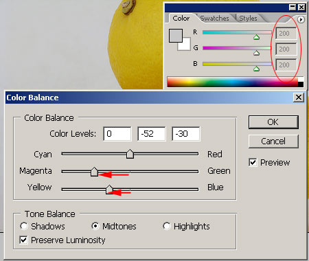
In Color Balance dialog check Midtones and Preserve Luminosityoptions as well so that brightness of the photo remains.
Carefully shift Magenta-Green slider to the left and meanwhile check R and G values at the Color palette. Stop the slider when the two numbers are the same. In our case it is 200. Finally, shift Yellow-Blueslider to the left while checking B color channel constantly. In our case it is 200.
The above values are valid for our sample photo only. If yours shows a different value, then shift the sliders in accordance with what Color palette indicates. What is important is that you measure a grey area and then make the values equal.
All for two-hundred
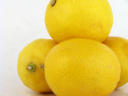
The resulting photo shows the right colors. The background is pale, greyish-white, and the lemons are as yellow as they should be. Yes, lemon yellow…