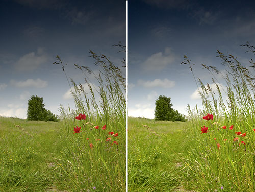
Somehow my digital camera never produces pictures like those in the latest landscape albums I bought. The film Velvia 50, renowned for its excellent saturation, is and old friend of nature photographers. Hundreds of digital photographers and doyens of Photoshop actions and plugins tried to emulate a similar effect, with more or less success. Even if we don’t have a philosopher’s stone, we join the regiment of Velvia imitators. We do have an advantage over many such plugins and actions: we offer a possible solution free of charge. You have to decide for yourself, whether you find it effective enough.
For a starter, you’d do well to carry out a slight contrast adjustment if you find it too flat. I used one of the simplest methods, Image/Adjustments/Levels, to make the grey veil on the original photo vanish.

Then I chose Adjustment Layer from the bottom of the Layers palette, and clicked Brightness/Contrast. I set Contrast to +40.
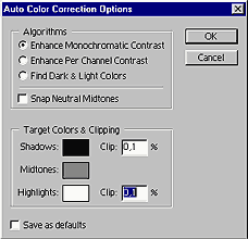
I clicked OK and set the blending mode from Normal to Color so that the contrast increase would only affect the colors. I duplicated the Brightness/Contrast layer to increase the effect. Now I switched back to the Background layer and created another Adjustment Layer with the Levels command. I chose Enhance Monochromatic Contrast from the Options menu, only affecting lightness, and set the Clip values for Shadows and Highlights to 0.1% each.
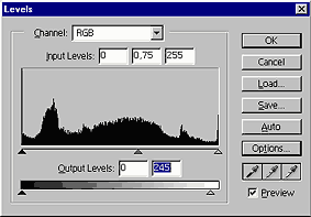
Returning to the Levels dialog, I set midtones for Input Levels to 0.75, and light tones for Output Levels to 245. Naturally, you have to set the lightness values according to your taste. Pay attention to not creating irritatingly whiteish or blackish blots in the picture. Set the blending mode for the layer to Luminosity.
I returned to the Background layer again, duplicated it, and applied a Filter/Artistic/Film Grain filter on the new layer with the settings indicated below. This added graininess similar to that of film photographs. Then I set the blending mode for the layer to Luminosity.
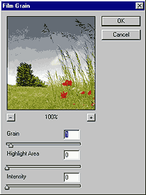
This provided a slight graininess. The step can be omitted if you don’t like adding a grainy quality to the photo, it’s up to your taste. I applied it because of two things. Firstly, we want to create a film-like general effect that can be enhanced by graininess, and secondly, over-increasing colors can boost color noise—especially when the photo already contained large amounts of noise originally—that can be concealed to a degree this way.
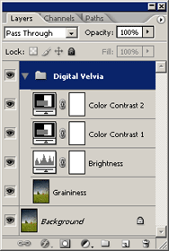
I then renamed the layers I had (by double-clicking their names) for easier identification. The last layer I mentioned became Graininess, the Levels layer Brightness, and the two Brightness/Contrast layers were renamed to Color Contrast 1 and 2. After all this renaming, I clicked the small folder icon at the bottom (New Set) to create a layer set which I named Digital Velvia. One by one, beginning with the topmost layer, I dragged them onto the folder to group them. The Background layer stayed outside.
Of course, this last action didn’t change anything in the picture, but makes the “Digital Velvia” effect more organized and more easily manageable.
You can set the intensity of all the layers at once (that is, the intensity of the Digital Velvia effect relative to the original image) by clicking the Digital Velvia folder and setting Opacity. Changing the Opacity values of Color Contrast 1 and 2 specifies the intensity of colors, the Brightness layer can be used to refine lightness levels, and Graininess adjusts the film-like effect (or even turns it off, if you find it annoying). If fine-tuning produces the result you want, click Layers/Flatten Image to merge the layers.
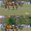
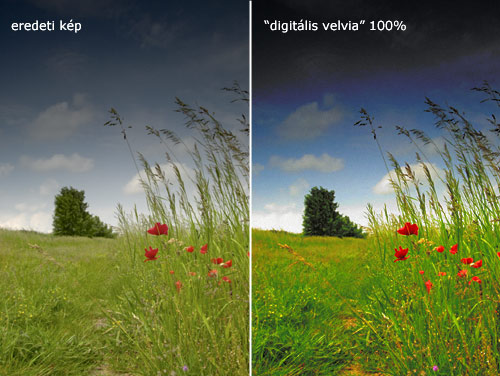
original photo / digital velvia
Another thing:
Increasing color contrast can do good to your landscape and nature photos, but it may not excel when applied to portraits, for example. Use it in moderation, for in itself it doesn’t make a photo look nice. However, it can help you emphasize that picture’s beauties that may be hidden at the first glance. On the other hand, it’s not worth to apply it on badly taken photos.