Up for the neon green!
Present
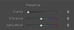
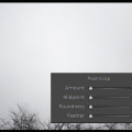
This strangely named group of tools can be found at the beginning of Lightroom Develop section, directly under Tone corrections. It is called Presence, but it could also be named Liveliness actually.
The three sliders here do give the kiss of life to the picture especially regarding colors and contrasts. Let’s take a look at each of them.
Clear as Day
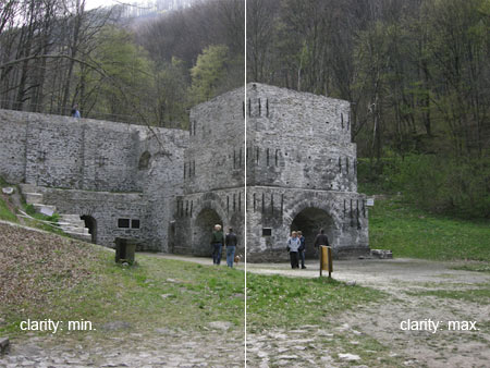
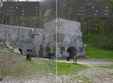
The name of the button Clarity is a tell-tale one: it affects the contrast of the photo but not to the extent as Contrast introduced in the previous article. Clarity increases microcontrast as well as the fine details and the light difference between the pixels around these details. It could also be regarded as a rough sharpening method. It makes the details of the picture appear more hard, more distinguishable. In other words, this turns our cheap lens with less contrast into a more expensive one. It comes handy with telephoto lens, for example, when the contrast of our photo is deteriorated by high humidity in the air. However, take care not to overuse it as it can result an unnatural fine contrast. After each increase, have a 100% view of the picture to see how real the contrast of the details appear.
The picture above is acceptable in this size, but in full size the details are too hard.
Dynamic colors

Vibrance in fact means the contrast and dynamics of colors. When you increase it, the liveliness of colors will be stronger, while if you decrease it, you will get a nearly colorless picture. Vibrance should not be mixed up with Saturation in the next line — despite the fact that we can strongly increase or decrease saturation with this button as well—; it really controls presence and liveliness of colors.
Saturation
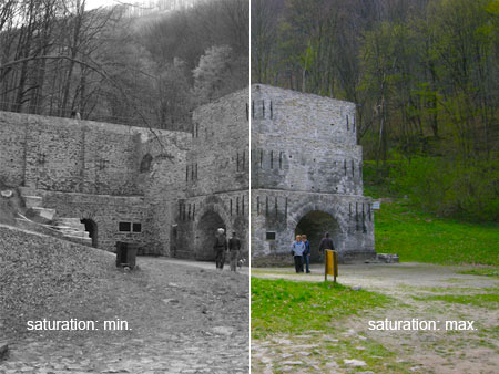
Saturation is a well-known tool among picture editors. It influences the strength and saturation of colors. If it is set to the lowest value, we will get a black-and-white photo, while when set to the highest value, the result will be a picture with exaggerated colors. It is best to use it together with Vibrance, but be careful with increasing it high as it can also create an unnatural effect and may increase visibility of color noise.
Presence you can sense
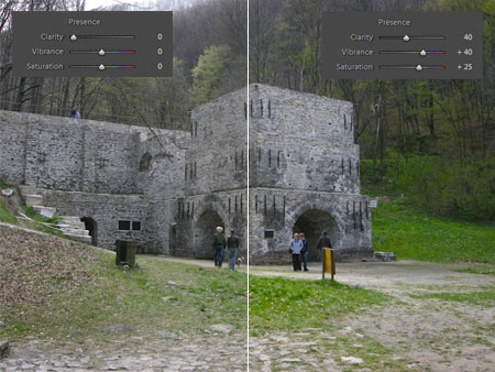
When employing the sliders of Presence group, we can achieve the illusion that the photo was taken by a camera with a better lens. A more accentuated microcontrast and lively colors will prosper on the originally plain and dull photo. The presence of colors is virtually palpable.